The Haws
Background
The Haws is a loungewear brand that started with one simple idea: comfort shouldn’t mean looking like you just rolled out of bed. The founder wanted pieces she could wear at home and still feel presentable, not styled, not “done up,” just not messy. The clothes existed. The brand didn’t. So… that’s where we came in.
The Design Problem
We had to create an identity that didn’t fall into the usual loungewear traps, too soft, too girly, too sterile, too sporty. It needed to feel grown, but without being corporat-ish as well.
Casual, but not lazy.
What We Did
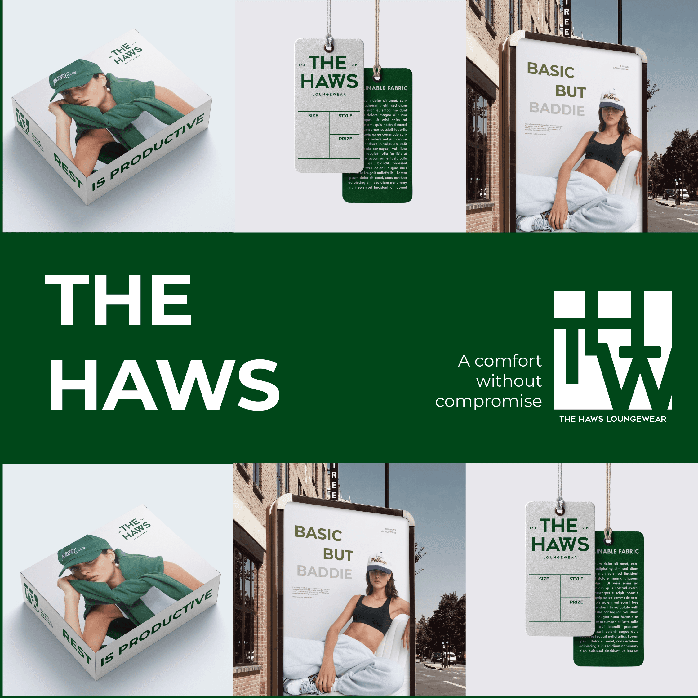
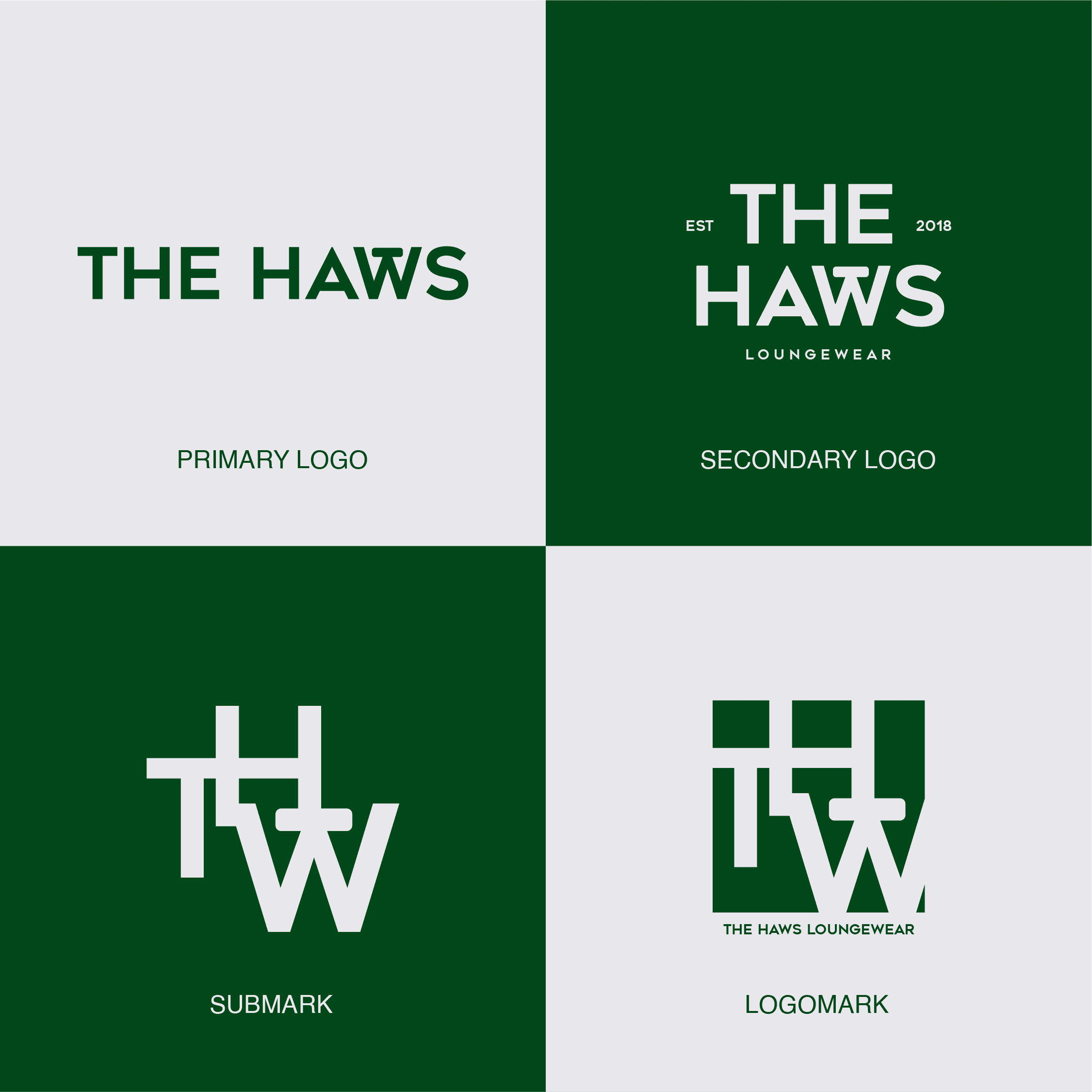
We stripped the visuals back to the essentials. Clean, clear typography, nothing trendy. A wordmark that felt settled and unfussy. Colors that match the tone of the clothes.
We also made sure the brand had space to breathe. Whitespace and natural textures.
The Result
The identity feels like the product: clean, quiet, and functional. You notice it, but it doesn’t get in the way. It doesn’t perform. It just holds everything together, visually and tonally. And most importantly, it leaves room for the product to be the focus, which was the point.