Doughlicious

ESSENTIAL PACKAGE | Brand Strategy · Verbal & Visual Identity
ESSENTIALS PACKAGE | Brand Strategy · Messaging · Verbal & Visual Identity · and more
Where Cravings Begin
What started as a guilty-pleasure recipe between two friends quickly turned into something bigger. Doughlicious was never meant to be just another snack—it was born to tempt. Seven dangerously indulgent flavors, each named after one of the seven deadly sins, ready to hit shelves and break a few rules along the way.
The vision? A brand that feels as irresistible as the product itself. Something bold, something cheeky, and absolutely unforgettable.
Lost in the Aisle
Even the most crave-worthy products can get buried in a crowded category. Cookie dough is a competitive shelf, and Doughlicious needed to punch through the noise. The challenge wasn’t just standing out visually—it was owning a brand voice and story that made indulgence feel like a statement, not a secret.
How do you build a brand that leans into sin without falling into cliché? That’s where we came in.
Designing Desire
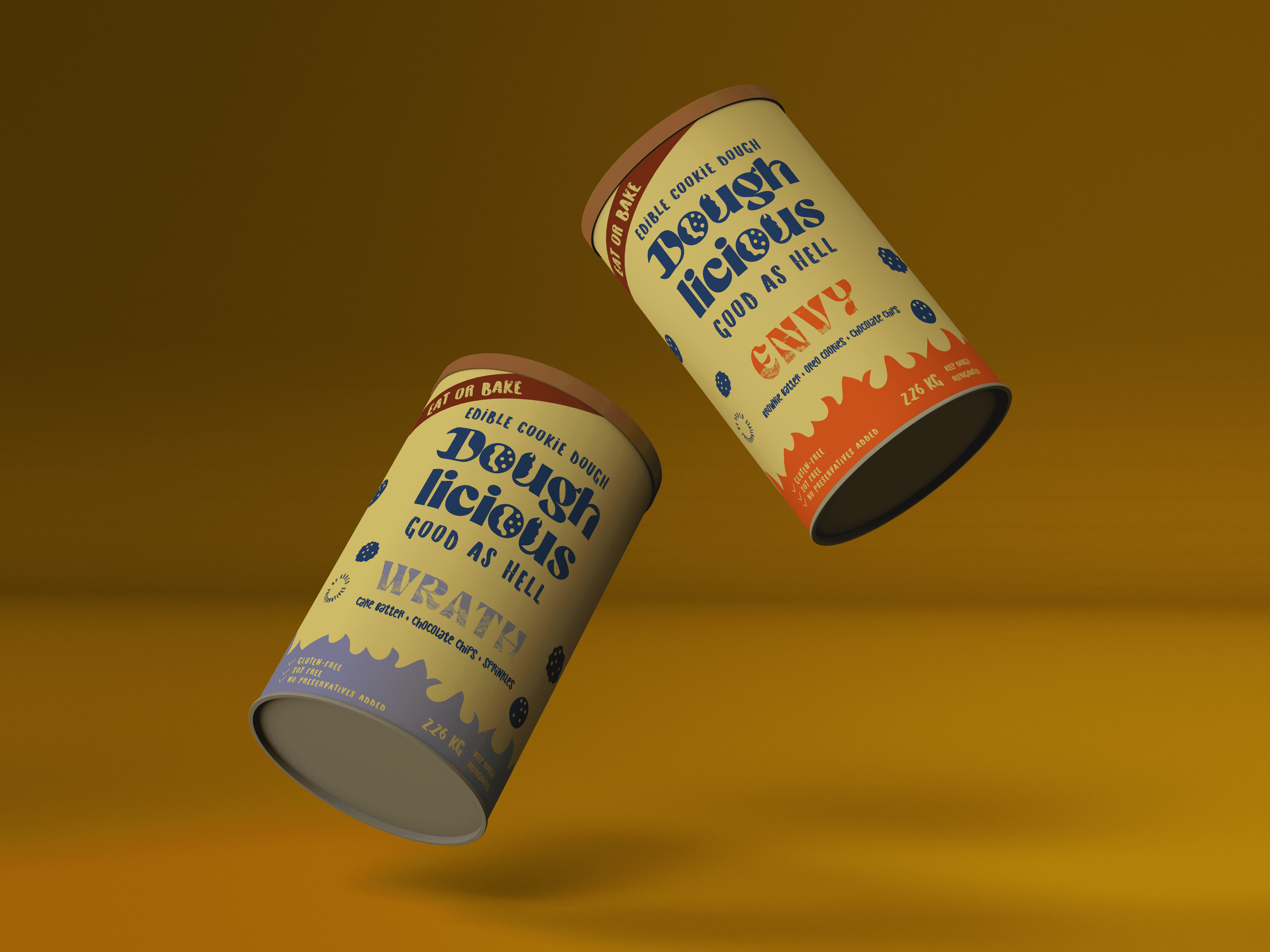
We built the brand from the sin up. Each flavor was treated like a persona—Lust drips in deep red, Sloth lounges in soft lilac, Wrath rages in fiery scarlet. The visual identity is bold and unapologetic, built to provoke double-takes in the aisle.
The logo delivers a wink, not a shout. Packaging became the vehicle for play, temptation, and bold simplicity. And the voice? Confident, clever, and just a little wicked—inviting consumers to indulge, guilt-free.
Crave. Seen. Sold.
Doughlicious transformed from a behind-the-scenes recipe into a full-scale CPG brand that turns heads and moves units. Designed to thrive on both shelf and screen, the identity system leaves room for line extensions, seasonal drops, and brand partnerships.
Now it’s more than a product. It’s a flavor-forward rebellion with a loyal (and growing) following. Because in the world of indulgence, the boldest brand wins.