Cocoon Blankets
Dream
Cocoon is a Brussels-based brand making sustainable blankets with bold patterns. The founders were two women with a solid eye for design and a strong point of view. They came to us with a product that was working, but a brand that wasn’t saying much. It needed clarity and… an edge
Challenge
They didn’t want to look like every other “sustainable home brand.” beige, cursive font. Cocoon was playful, loud (in a good way), and had real substance behind the aesthetics. But none of that was coming through. Our job was to give the brand structure, a strategy, voice, and look that made sense without flattening what already made it interesting.
Breakthrough
– What do they make? Blankets.
– What’s different? They're sustainable, but they’re also not boring.
– Who’s it for? People who care about the planet, but also want color in their homes.
From there, we built their brand system:
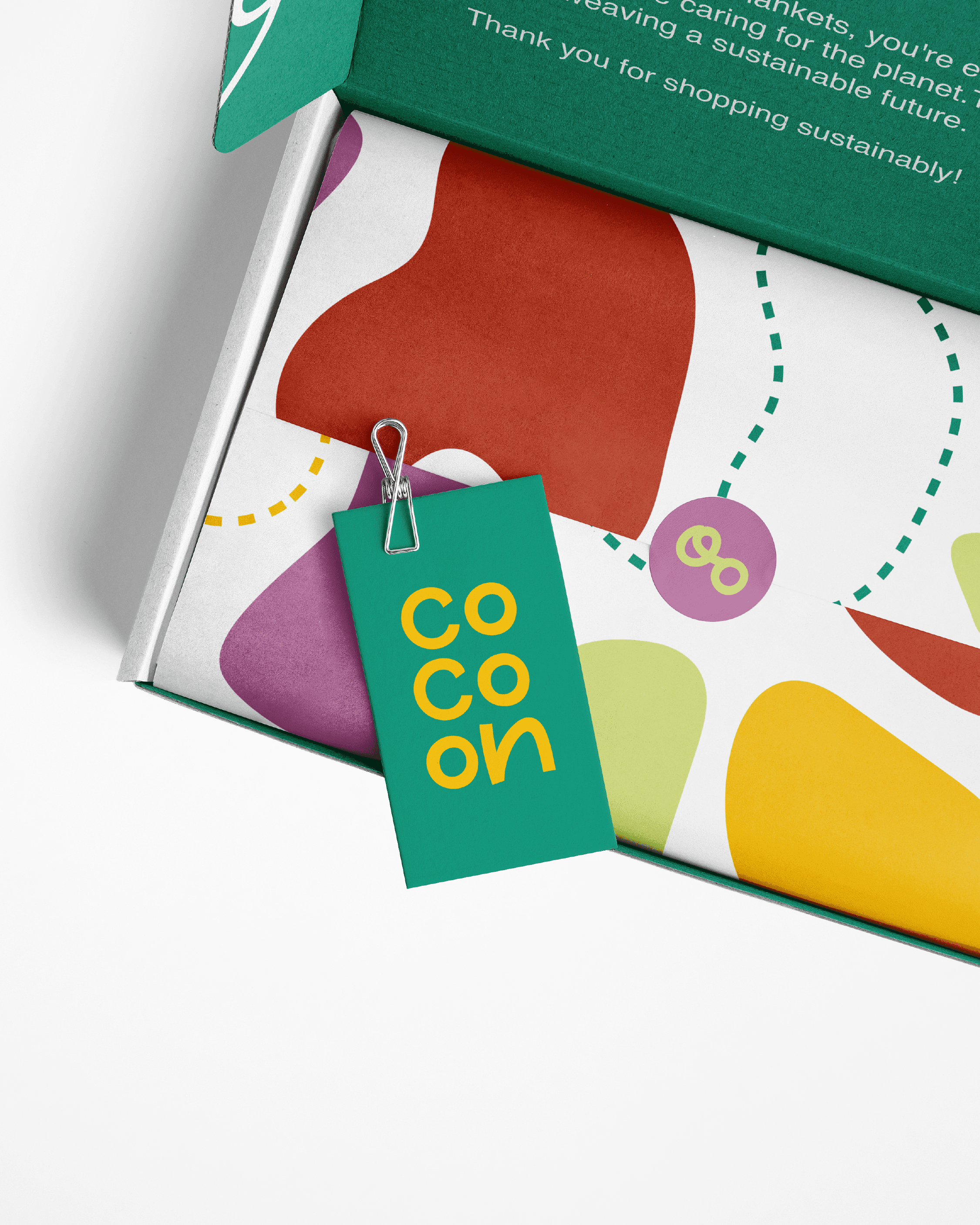
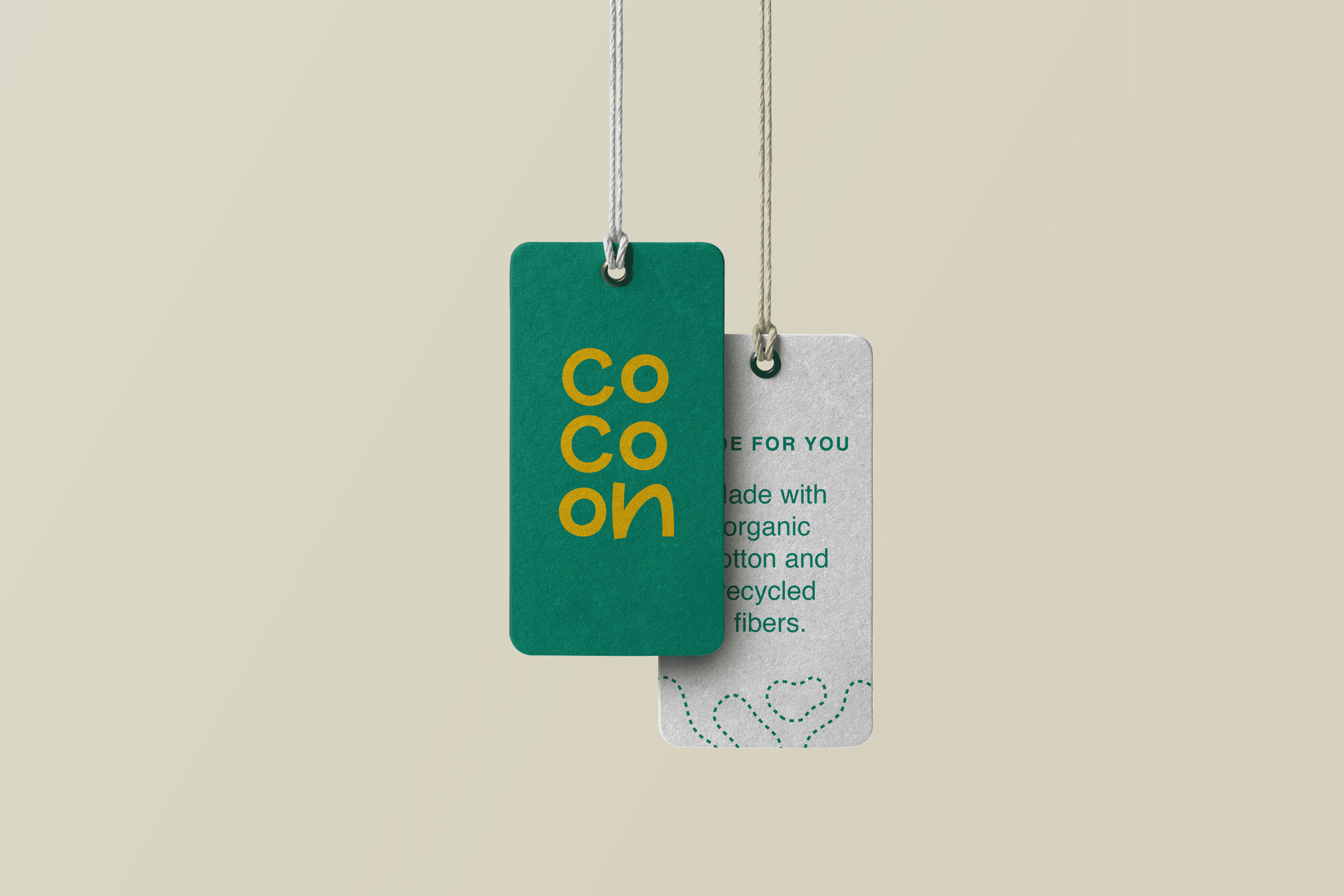
A flexible logo that plays nice with bold patterns
A color palette pulled from real-life interiors
Packaging that doesn’t try to look “luxury” just handcrafted, raw, plus recyclable
And we then gave the product name some charm but kept it simple.
Transformation
Then comes the result, fun, solid, and actually enjoyable to look at. People get what Cocoon is now, it’s clear, and different. Sales picked up, especially online. And the brand also started getting featured when it finally had a clear point of view.